Hello
I'm Joe Fox, a journalist and developer at The Washington Post. Below are examples of my work. Follow me on Twitter.
Work
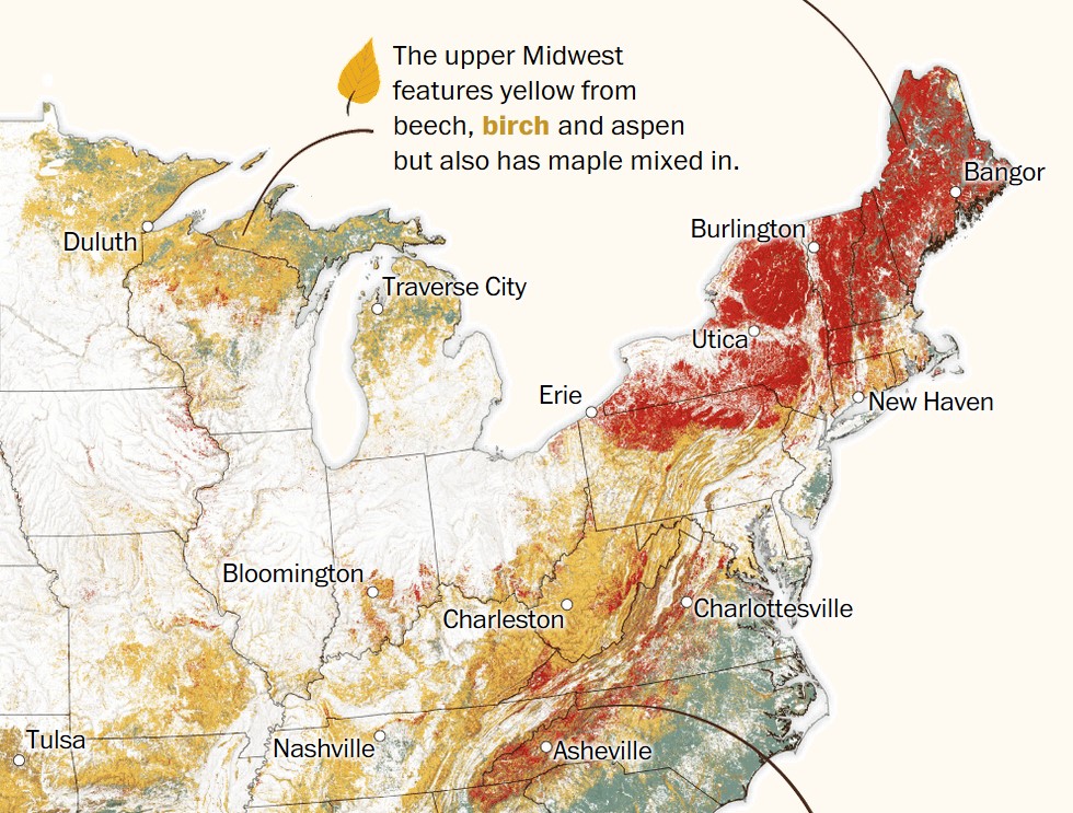
October 9, 2019
Fantastic fall foliage … and where to find it
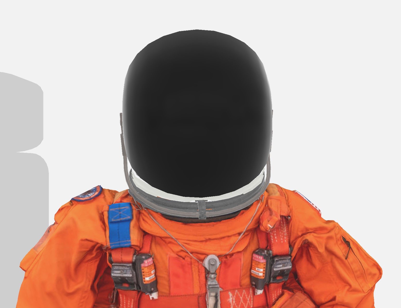
July 17, 2019
How to dress for space
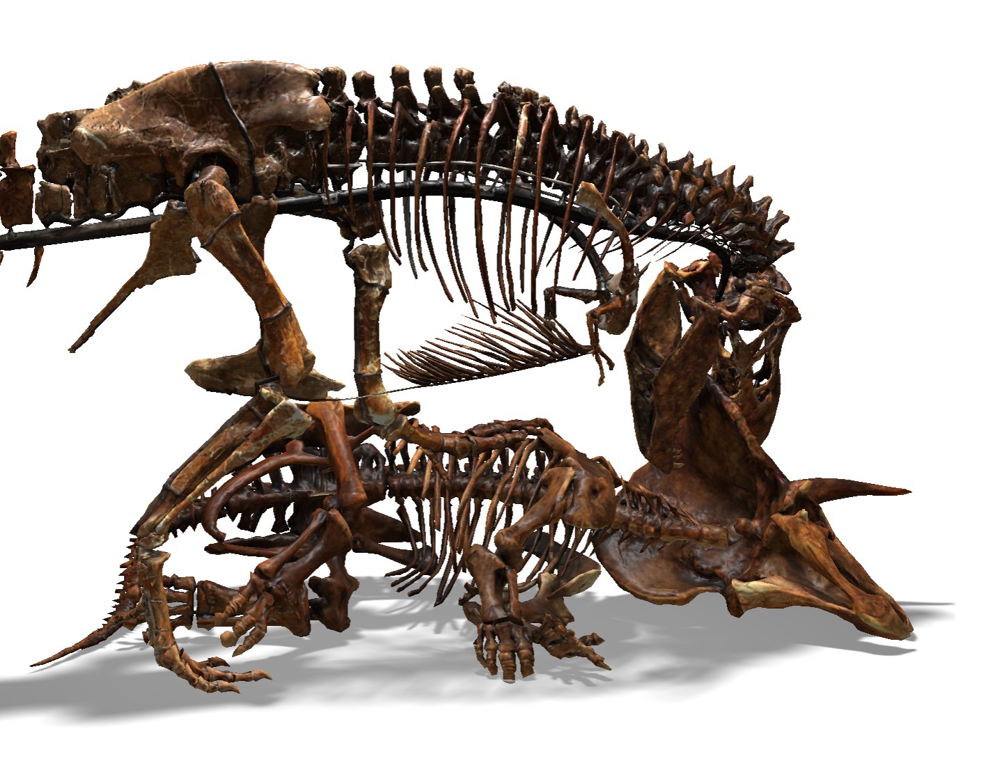
June 6, 2019
A new old home for the nation’s dinosaurs
April 25, 2019
How terror detonated with precision across Sri Lanka

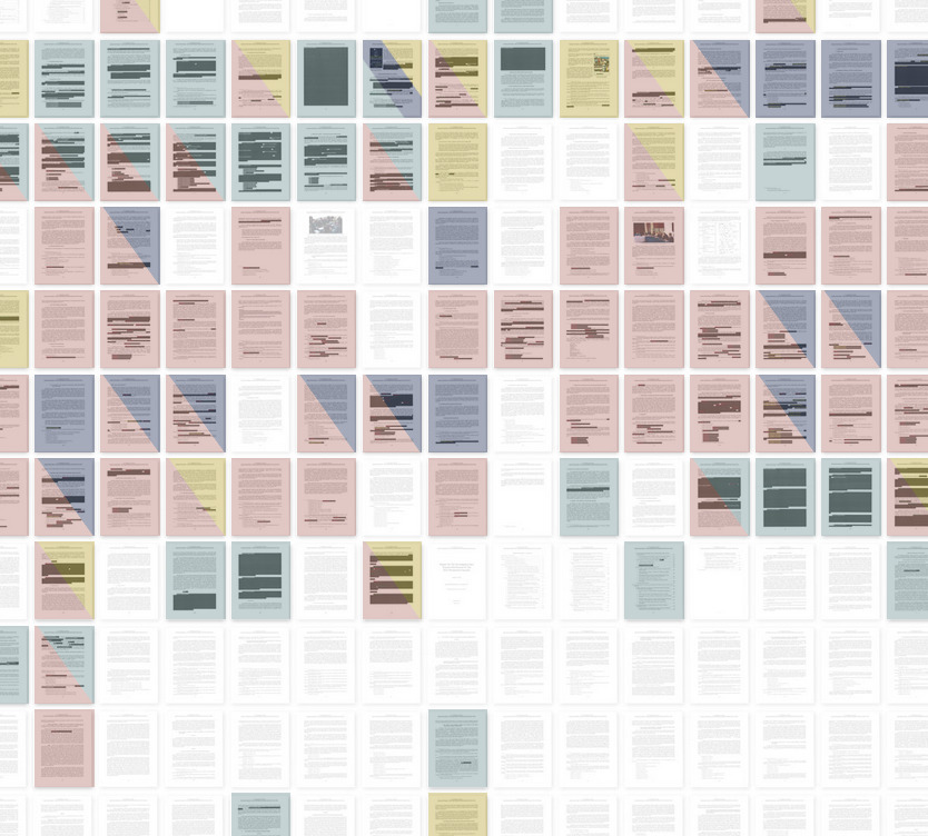
April 19, 2019
Mueller report offers clues to what’s behind the redactions
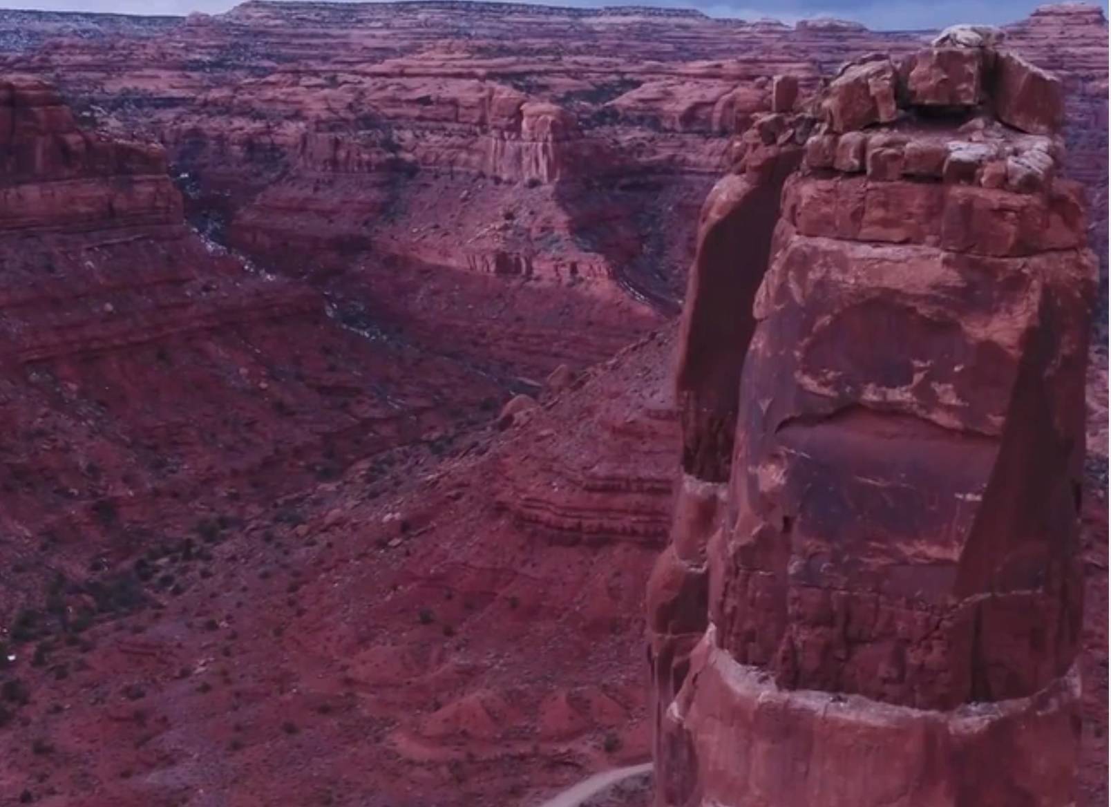
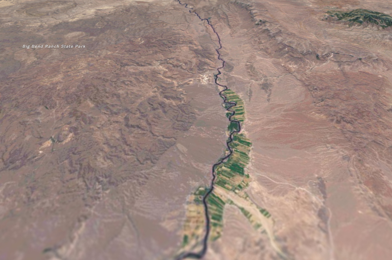
April 2, 2019
What remains of Bears Ears
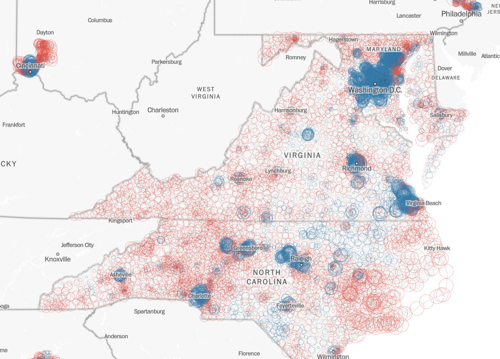
November 9, 2018
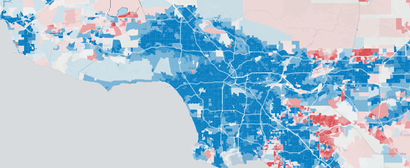
These wealthy neighborhoods delivered Democrats the House majority
October 17, 2018
BORDERLINE: Navigating the invisible boundary and physical barriers that define the U.S.-Mexico border
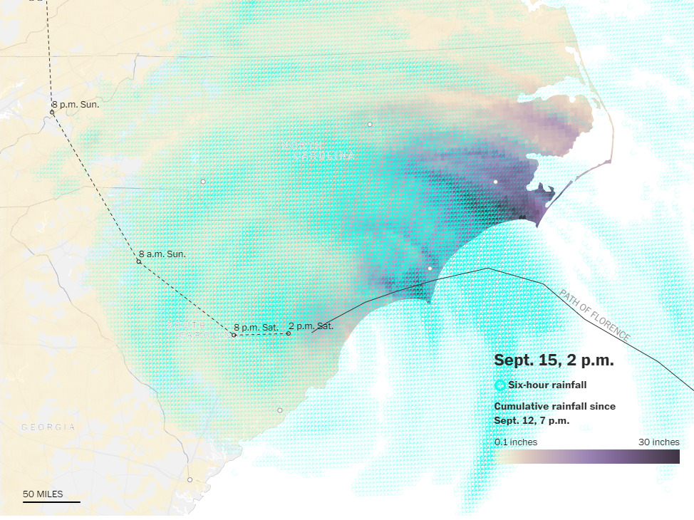
September 14, 2018
Tracking Florence's deluge
July 16, 2018
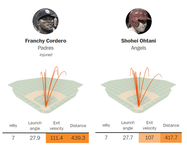
Just how weak is this year’s Home Run Derby field?
March 22, 2018
How to find shade at Dodger Stadium

January 23, 2018
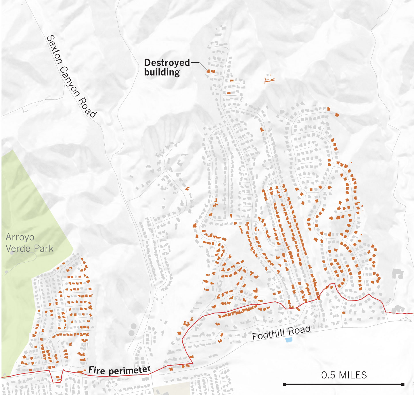
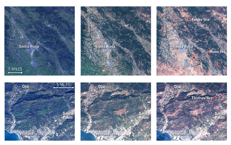
The Thomas fire: 40 days of devastation

December 6, 2017
Before and after: Where the Thomas fire destroyed buildings in Ventura
November 2, 2017
Despite a record number of strikeouts, Dodgers’ pitchers fell short
October 13, 2017
Why the 2017 fire season has been one of California’s worst
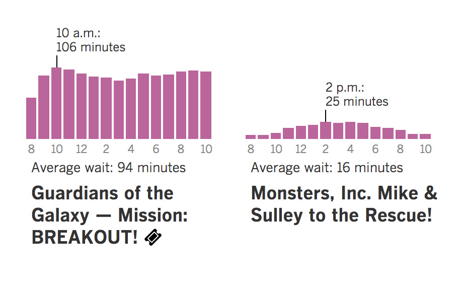
July 12, 2017
Don't waste your time waiting in line at Disneyland
February 8, 2017
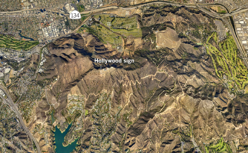
A week in the life of P‑22, the big cat who shares Griffith Park with millions of people
November 10, 2016
Did your neighborhood vote to _____________?
October 30, 2016
A web of campaign contributors
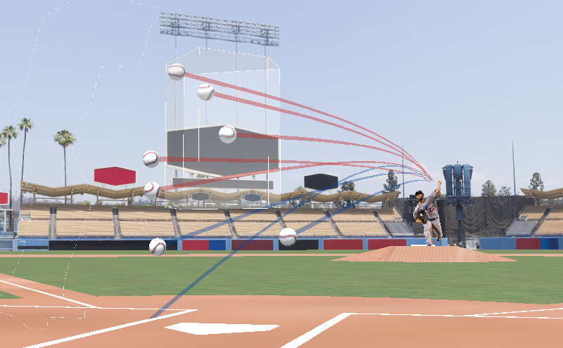
July 11, 2016
Pitch by pitch: How Clayton Kershaw dominates hitters
April 14, 2016
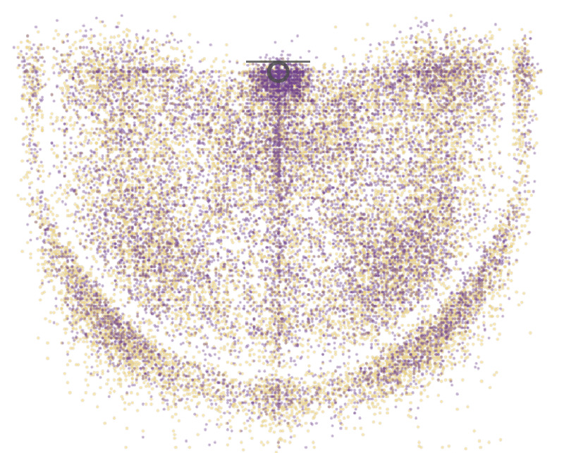
Every shot Kobe Bryant ever took. All 30,699 of them
February 25, 2016
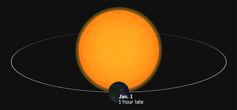
When would it be without leap years?
February 2, 2016
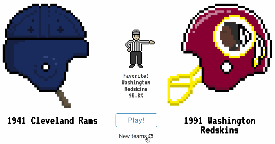
L.A. Rams throwback throw down
Twitter bots
I maintain a small collection of Twitter bots that I created as programming challenges.
- @burritopatents: creates burrito-related patent names
- @sombrerowatch: alerts followers when baseball players achieve the ultimate failure — a golden sombero (four strikeouts in one game)
- @andromedabot: posts a small portion of the largest image taken by the Hubble space telescope
- @colorschemez: creates new, mostly ugly color combinations with stupid names